
I've recently visited the Osaka Expo 2025 which was truly an amazing experience, only not digitally. In my last newsletter I dissected how it went wrong at the strategic level, and today I'm going to walk you through the actual pain, so that you can avoid the same mistakes for your businesses.
Website Fundamentals
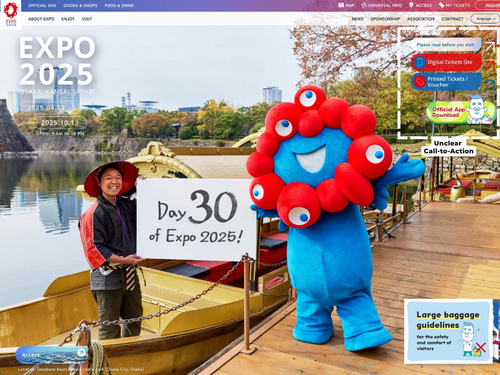
This is the Expo Website. Looking at the homepage, the website violates fundamental UX principles by hiding its most important function: buying tickets, in a sidebar rather than featuring it prominently. The design creates confusion with too many competing navigation options and buttons that all look visually similar. Notice how the critical 'Digital Tickets Site' button has the same visual weight as the non-essential 'App Download' button, making it difficult for visitors to immediately identify what action to take. This poor visual hierarchy forces users to scan the entire page rather than being naturally guided to the ticket purchase option, creating unnecessary friction especially for international visitors.
The website now offers 5 foreign languages in additional to Japanese and English, which has already increased comparing to when I made my purchase. However, all non-Japanese versions use automated machine translation rather than true localization, resulting in compromised information architecture and incomplete content across languages. The search functionality operates primarily on the Japanese content map, meaning international visitors receive severely limited results unless they perform queries in Japanese. This internationalization failure created a frustrating discovery loop where I spent over an hour before realizing the optimal path was to browse the Japanese site and rely on Google translate, unfortunately.
Finally, the website is painfully slow to load and respond.
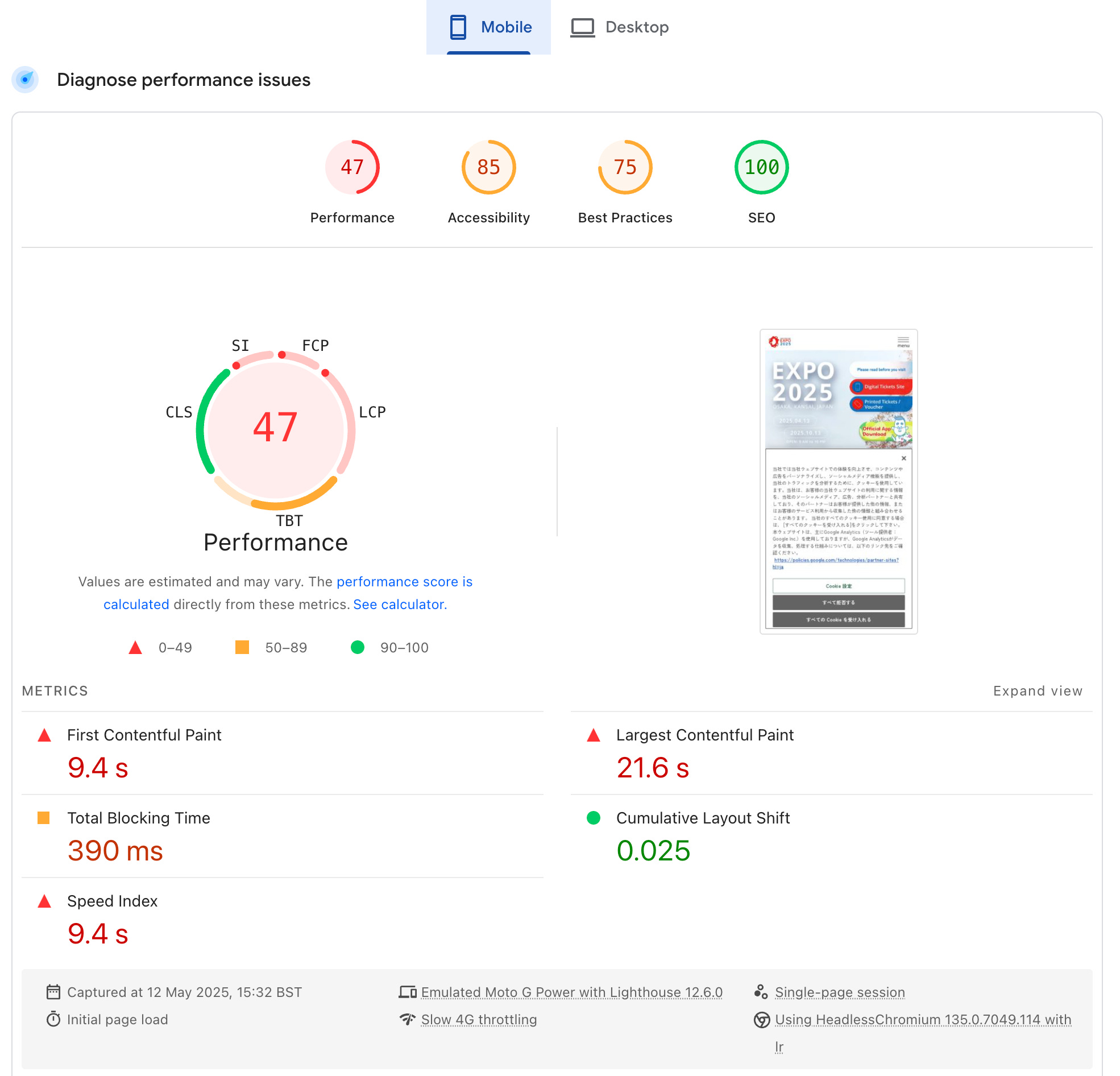
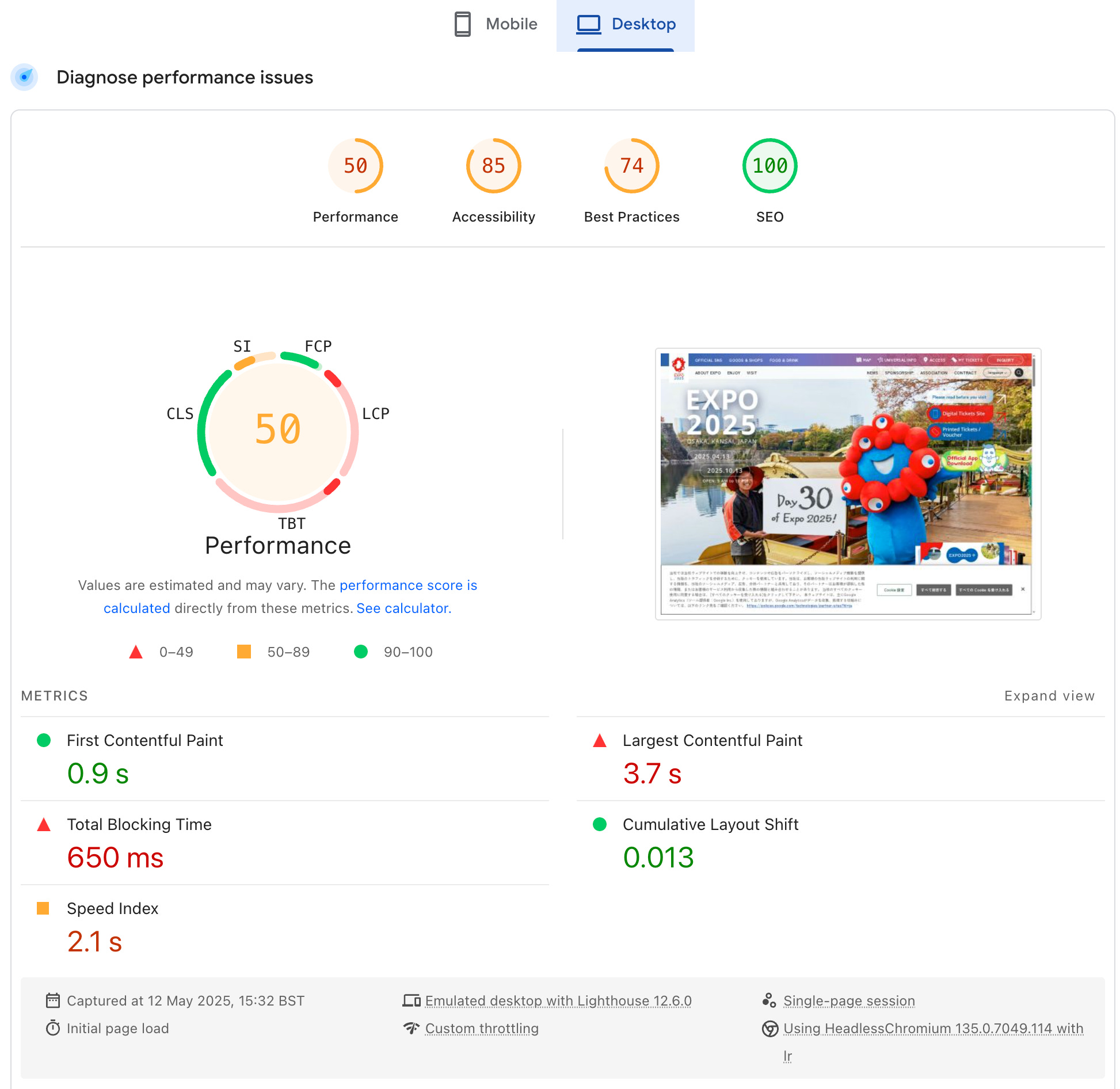
Google's PageSpeed Insights shows that the site performs poorly, scoring just 47/100 on mobile and 50/100 on desktop. Mobile visitors must wait an excruciating 21.6 seconds before seeing the main content—nearly 9 times longer than recommended. Even desktop users face significant delays of 3.7 seconds. Cloudflare recommends that pages loading in 2.4 seconds achieved a 1.9% conversion rate, while those taking 5.7+ seconds saw rates plummet to just 0.6%.
Beyond loading issues, the site suffers from what developers call 'interaction delays'—when you click a button, the website freezes for over half a second (650ms) before responding. This explains why I often found myself frantically tapping buttons multiple times, which eventually leads me to the 404 screen. Honestly, I cannot recall how many times I just wanted to give this up.
📣Updates: I have launched my first digital product! Check out this Beginner’s Guide to Digital Marketing Strategy and develop your brand's positioning, competitive analysis, customer persona, marketing budget plan and much more!
User Experience Nightmare
I am sorry but this only gets worse. Instead of boring you with the step-by-step process of the consumer journey, I have made this quick diagram: there's at least 17 steps you need to follow before enjoying Expo, and that's only if you are already extremely familiar with its map, pavilions, procedures, transport, purchasing procedures etc.
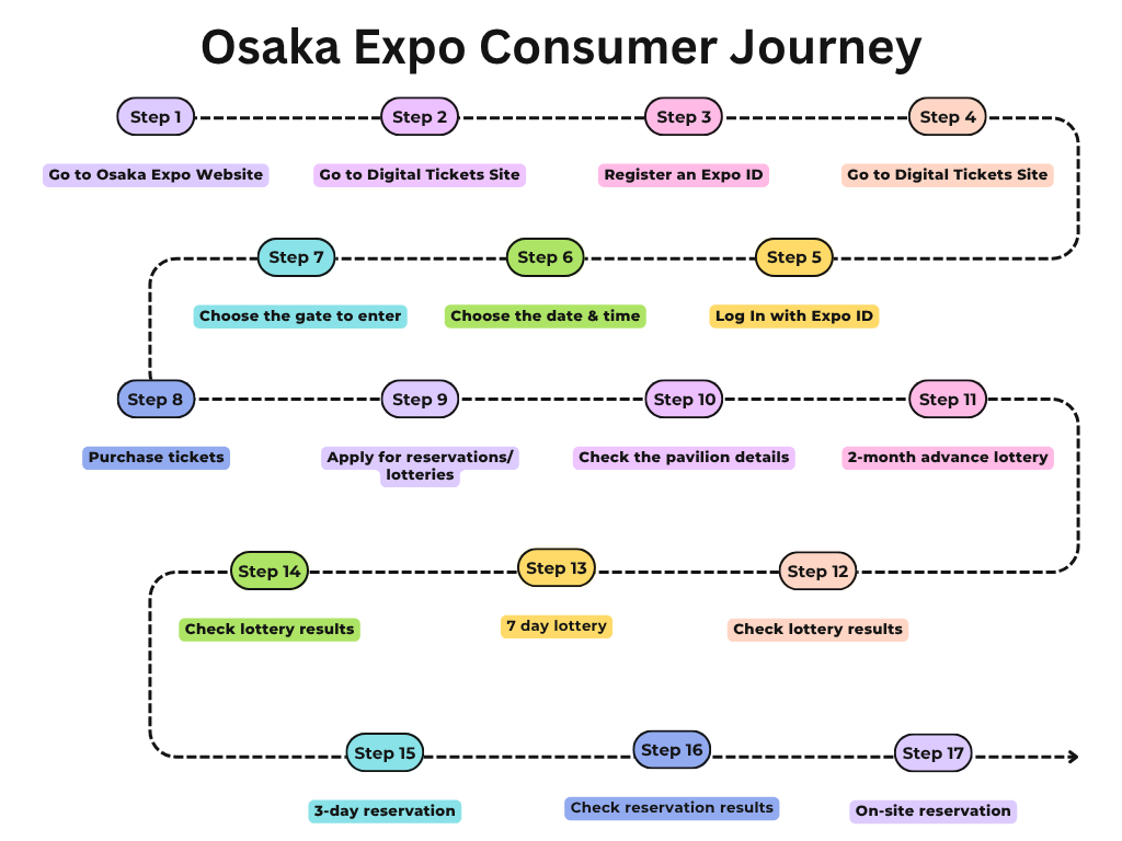
The whole consumer journey for me took 3 months. Yes, 3 months. I purchased the ticket in early 2025, only to discover that buying a ticket doesn't guarantee entrance to any pavilions. Instead, I needed to:
- Set calendar reminders for the 2-month advance lottery
- Research and select my top 5 pavilion choices
- Submit the lottery entries and check the results later
- Repeat the entire process for the 7-day lottery with another top 5 choices
- Set reminders for the 3-day advance reservation window
- Continue making on-site reservations while at the Expo
The most frustrating part was figuring out which pavilions to choose. You'd expect an interactive map where you could click on pavilions to see details and availability. But no, the process was nothing like that.
First, you go to the interactive map.
And then you zoom in for the specific pavilion.
Linked another page for pavilion details. Ah. Reservation needed for this one.
Open separately the specific pavilion URL to see what exactly it is about.
Repeat for 100+ pavilions.
It's a fundamental principle of e-commerce that the purchasing journey should be as simple as possible, the best practice is to keep it within 5 steps from cart to order review. Here's how it could be improved:
- Provide clear process overview - Start with a simple visual flowchart showing the 5 main steps of the ticket and reservation process, helping users understand the full journey before they begin
- Add persistent progress indicator - Include a prominent progress bar at the top of the interface that shows users exactly where they are in the process and how much remains
- Use expandable sections - Organize the process as a vertical timeline with collapsible sections that open sequentially as users complete each step, keeping the interface focused on the current task
- Maintain a single page experience - Eliminate unnecessary page reloads by keeping users on the same page throughout the process, with contextual information displayed in side panels (like maps when selecting entry gates or pavilion details during reservation)
- Save user preferences - Store user selections and form data between sessions, eliminating the frustrating need to re-enter the same pavilion choices for each lottery round
- Implement automated reminders - Replace manual alarm-setting with a proper notification system that sends timely emails and calendar invites for lottery openings and results
- Design for mobile first - Optimize the entire experience for smartphone users with touch-friendly controls and a comprehensive app that functions without constant website redirects
Wait. Osaka Expo has an app, no? That’s even more interesting.
A Mobile App with no native functionalities
Expo encouraged users to download the app for “more accessible and more convenient” experience. That was not delivered unfortunately. This is the main menu of the app.
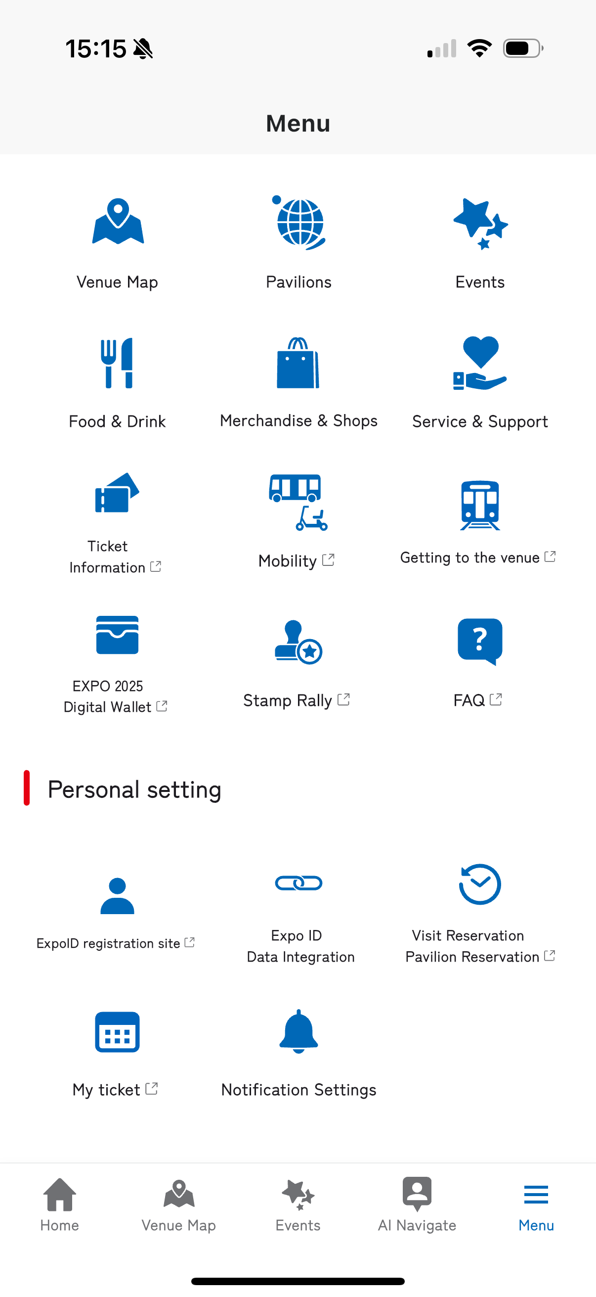
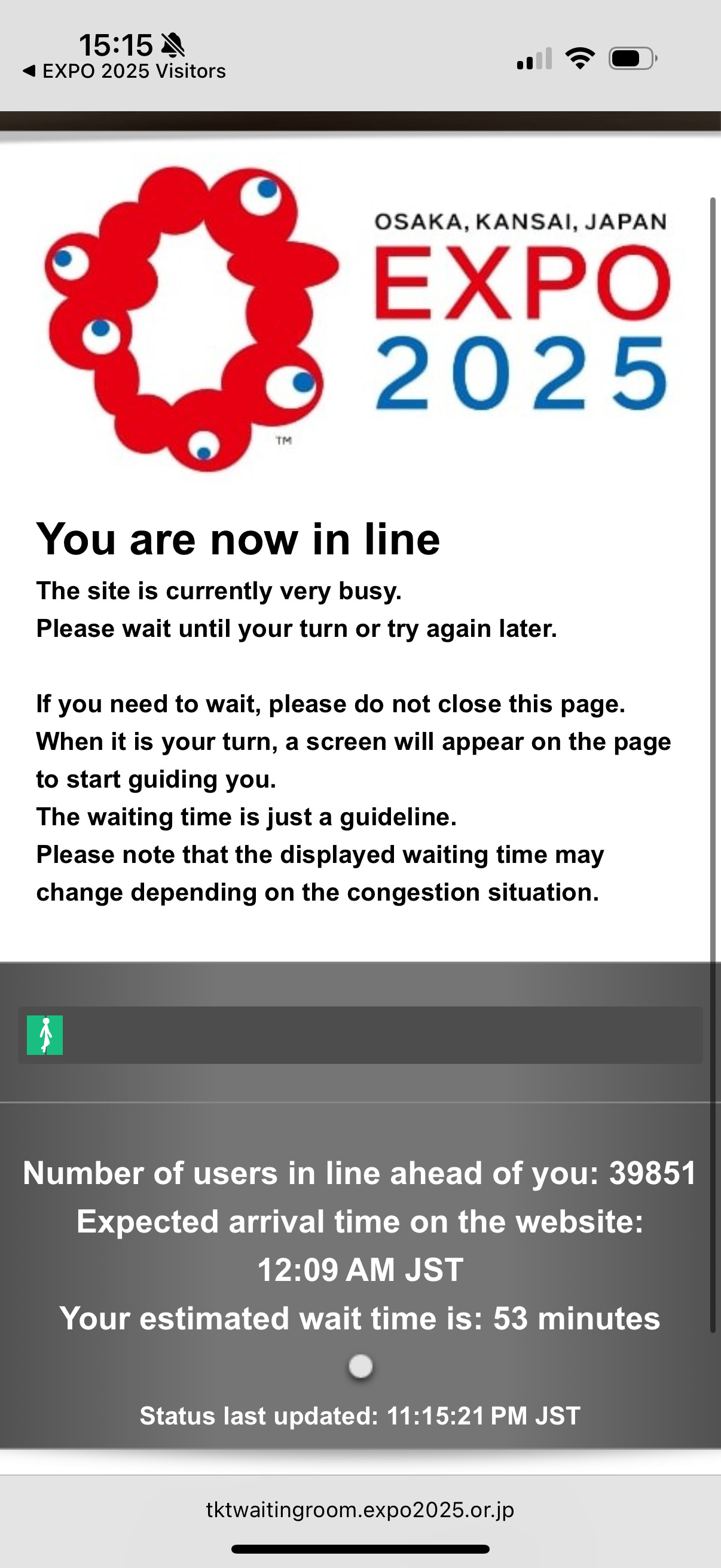
As you can see, most of the important functions, such as My Tickets, Reservation, or even transport details are redirected to external websites (indicated by the "↗" icons). The app serves merely as a link collection rather than providing true native functionality. This represents a fundamental misunderstanding of mobile app design principles: users download an app expecting native capabilities like offline ticket storage, streamlined pavilion reservations, and real-time queue updates. Now, visitors must constantly switch contexts between app and browser, this fragmentation creates significant cognitive load and session disruption. My frustration peaked when I clicked "My Ticket" and discovered a 53-minute virtual queue just to access the site. Seriously?
On-site Digital Experience
Even after surviving the ticket purchase ordeal and finally arriving at the Expo, the digital nightmare continues. Most visitors only secure reservations for 2 pavilions through the lottery system and must compete for additional pavilion slots while on-site. This requires constantly refreshing the website (not the app) to catch last-minute openings. The mobile web experience creates additional frustrations:
- The system logs you out every 30 minutes, forcing repeated login cycles
- Each reservation requires multiple steps: select tickets, check pavilion availability, and generate a new QR code
- All this data usage happens without any WiFi provided at the Expo
- There are no digital displays showing waiting times or walk-in availability anywhere on the massive 300+ acre site (which takes at least 3 hours to walk across)
- Some pavilions require downloading separate apps, which are only available in the Japanese App Store
- Language barriers persist, with some pavilions lacking non-Japanese translations
The combined effect forces visitors to spend more time managing their digital experience than actually enjoying the Expo itself.
Indeed, even local Japanese visitors have voiced numerous complaints about the Expo website. The organizers faced public backlash for excessive data collection that went far beyond the basics. Beyond standard information like name and payment details, they initially demanded intrusive personal data including biometric information (face photos and fingerprints), employer details, social media credentials, and even personal status information about disabilities, marital status, and children. These invasive requirements were only removed after significant public outcry.
The Financial Impact: Millions in Lost Revenue
Let's translate all these usability disasters into real financial impact:
Direct Revenue Loss from Page Load Speed Alone
- Target international audience: 10% of 14M total expected visitors = 1.4M international tickets (a conservative estimate, as explained in Part 1)
- Conversion rate impact: According to Cloudflare research:
- Pages loading in 2.4 seconds: 1.9% conversion rate
- Pages loading in 5.7+ seconds: 0.6% conversion rate
- Result: A 68.4% reduction in conversion rate from slow loading
- Applying to Osaka Expo: With a mobile site taking 21.6 seconds to load (nearly 4× slower than even the "bad" benchmark), this conversion drop translates to:
- Potential lost international tickets: 1.4M × 68.4% = 957,660 tickets
- Estimated ticket revenue impact: $194 million USD in lost ticket sales from international visitors alone
Additional Losses
This estimate is actually conservative, as it doesn't account for:
- The complex multi-step journey further decreasing conversion rates beyond just page speed issues
- Secondary spending (food, merchandise, transportation) from these lost visitors
- Multi-ticket purchases common among international travelers
- Higher international interest in the Expo compared to domestic attendees
- Similar conversion issues affecting domestic visitors despite their familiarity with Japanese websites
- Negative word-of-mouth deterring future purchases
Looking at Expo performance as of 9 May, ticket sales have turned around showing signs of hope, yet number of visitors is still at 60% of the projected figure. This means that there’s still chances to turn around these ticket holders’ impressions through providing a better user experience around reservation, as well as on-site digital assistance, which are integral to the ultimate sales. The question is, will they?
What it means for Japan
The theme of Osaka Expo is “Designing Future Society for Our Lives”. While Japan is notably famous for its pioneering robotic development, the Osaka Expo has unfortunately revealed how technologically behind is Japan’s infrastructure and digital experiences. With a diminishing population due to aging, Japan is increasingly reliant on foreigners, and it needs to figure out a way to connect with the rest of the world.
The strategic missteps we explored in Part 1 were dramatically compounded by these execution failures in the customer journey.
Other Articles You May Like
Engaging articles to enhance your digital marketing strategies.